With pubs and restaurants out of bounds, a rise in home drinking was predictable, but the volume of increase was something else. Nielsen’s Brager broke down the 291% increase over the end of March 2019 in total alcohol sales. There was the cork-popping 441% rise for the week ending 4th April, 387% uplift the following week, and then a more stable lower plateau as those stocking up filled home bars and fridges.
It was not altogether a Eureka idea. Richard Lee, Head of Alcohol at Kantar, was quoted by The Spirits Business as saying that ‘before Covid‐19, UK online alcohol sales were growing four times faster than in physical shops.’ But, just as the world of home working has become the new bread and butter, transition into a new way of drinking seems to have been sped up by the government’s strategy of dealing with the pandemic.
Although statistics vary slightly in terms of market research responses, the analysts are united in one thing: there has been a marked upturn in alcohol ecommerce this year. Not for nothing has The Whisky Exchange been barrelling it out: they claim they were having to place orders every five minutes at peak.
It’s a well-known fact that those who jump onto the unscheduled express train first get the best seats. The same is true in new alcohol consumption trends. Those who shine brightest online will reap in the best results, and ahead of the crowd.
‘OK, so how do we grab those seats?’ you’re asking. Out with the shop window display and in with the eye-catching bottle designs.
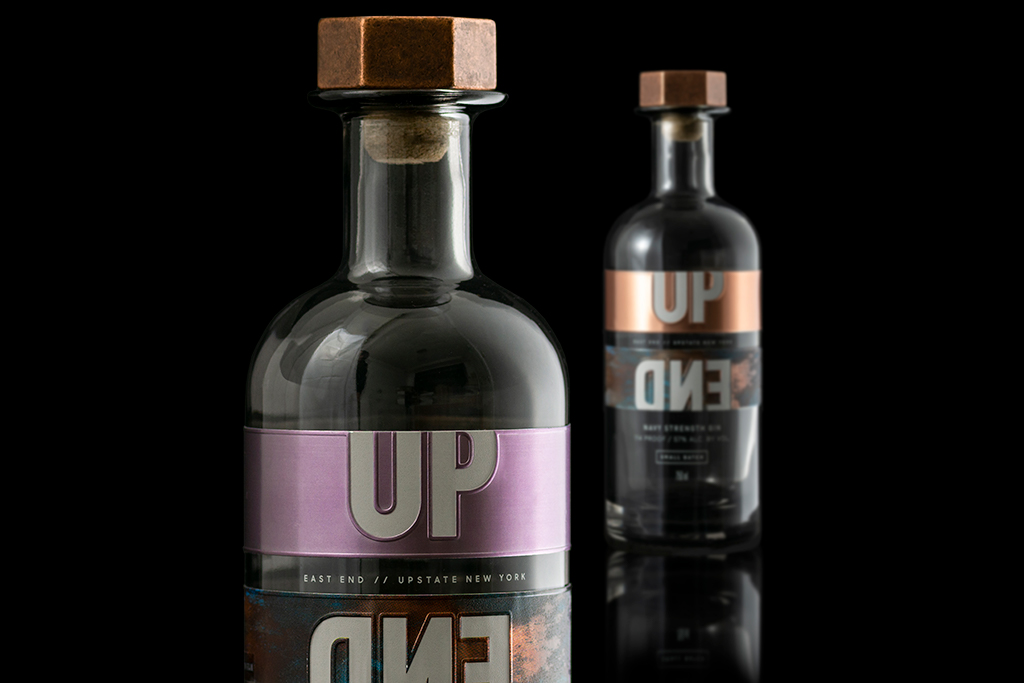
Standout print and unique colouring did the trick for the small batch UpEnd sweet tea gin we created the full wrap-around labels for. In vogue rose gold and marbled metallic backgrounds we had Up End embossed the respective ways round. Colour also proved popular with Silent Pool who chose instead a sweet pink neck label with copper banding and insect and flower silhouetting to complement their tranquil water coloured bottle, refreshing and spring like, aptly for their Rose Expression version of their classic gin. Two gins; very different in taste and appearance but the common theme of using colour to represent the brand and create that ‘pop’ on-shelf and on-screen has certainly been a winner.
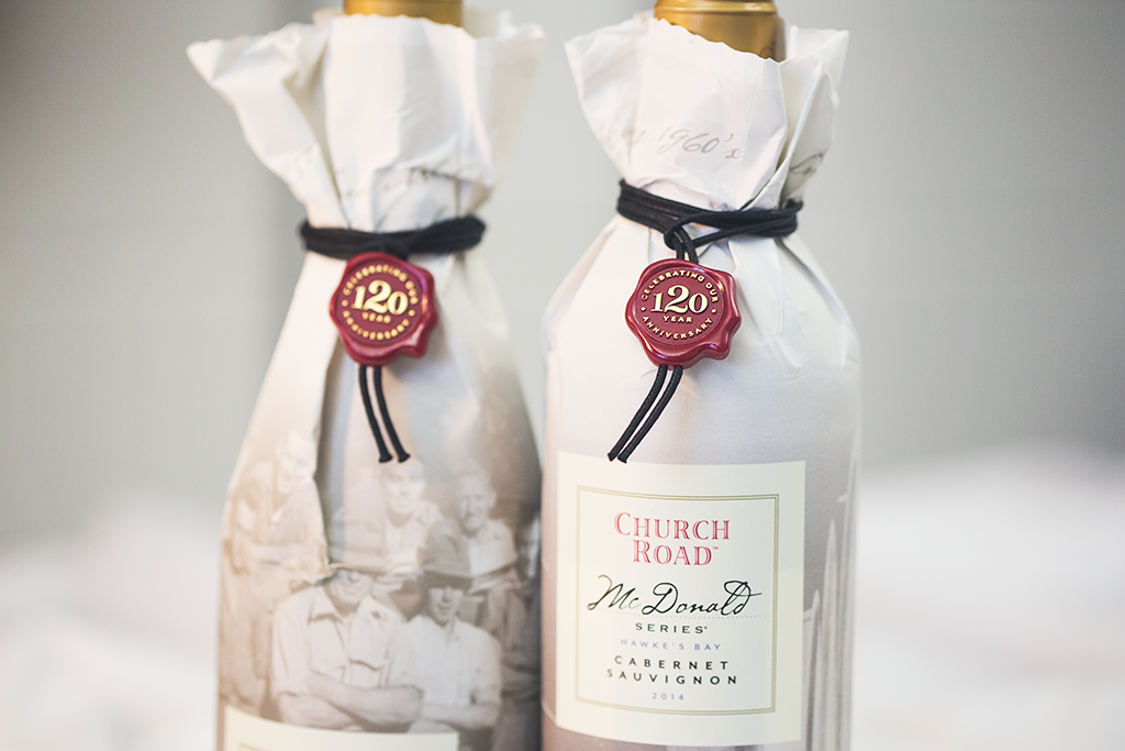
A 120-year-anniversary is not easily achieved, and some gift worthy packaging is needed to highlight that this is not your average Chardonnay. For the famous Church Road bottle, they chose a white paper wrap tied at the neck with a red faux wax seal commemorating the occasion, with vintage sepia illustrations below reminding us of their foundling roots. On the shelf the bottle looked stunning, and better still the unique and stand-out shaping of the wrap complete with the red seal created added appeal on a busy screen of bottles.
It’s not often you pass a lion without taking a second look. Such is the case with Kingsyaad Rum’s dare-to-pick-me King of the Beasts emblazoned bottle. And whether you are walking through a crowded restaurant or scrolling down an internet page, the metal badge with its intricately sculpted lion portrait takes not only the second look but a lot of stop-right-there and take-on-the-dare results. Unfortunately for them, the undecorated bottles alongside just might not make it off the platform this time. After all, where there is no tasting on offer and no product to feel, you have to start with looks and the opening experience
We’d love to find out more about your product or brand and we’d be delighted to arrange a consultation to discuss your product embellishment needs – simply fill in the form and we’ll be in touch.
Alternatively, give us a call on 01733 396080

