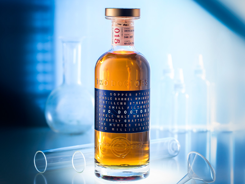
Founded in 2012, by Jerry and John – both doctors with a passion for distilling – Two Doctors Whiskey is an innovative premium whiskey brand, that stands out for its commitment to craftsmanship, sustainability, and innovation. We were approached by Two Doctors and their creative agency Single Double to provide a unique proposition that brought the original design to life, perfectly conveying the unique story of this brand and allowing it to stand out in a competitive marketplace.
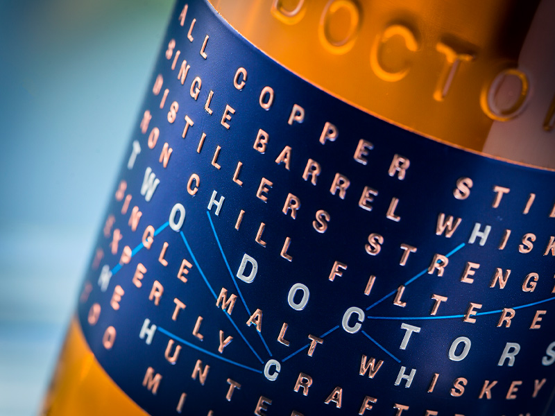
With the label needing to present a unique typographic design, it was important to achieve the sharpest of emboss and metal finishes. That’s why the team opted for our Marque™ label – epitomising the Doctor’s values of Precision and Mastery – it embodies a highly versatile, textured finish with intricate details that spans the width of the bottle.
The bottle also features the logo, imprinted on the glass, formed by a T&D locked up within a stethoscope; a nod to the medical background of the founders. This complements the blue and copper Marque™ metal label that strikes the eye as it contrasts against deep brown tones in the whiskey.
“Attention to detail, label material and embellishments are crucial to delivering a beautiful premium bottle. There are so many gorgeous custom bottles out there now and if timings or budget don’t allow for a custom bottle, then a beautiful finish and materials becomes even more important.” – Trudy Hunt, SingleDouble

The typographical Marque™ label holds a word puzzle which is discoverable at a closer inspection. The formula for Ethanol is precisely woven through the key brand messages on the front label C₂H₆O. A little ‘in joke’ for the scientists out there. The placement of the formula looks simple enough but creating the exact order of the messaging and getting it to read well was the real challenge!
Combining contrasting print and extensive embossing techniques, the final solution embodies the unique story behind the hand-made craft whiskey, creating a unique bottle design – exactly what the doctor ordered!
“This simple typographic design could have fallen flat if it didn’t deliver to the Doctor’s values of precision and mastery. To achieve the sharpest of emboss and metallic finishes we used Signets’ Marque label as it holds the emboss beautifully.” – Trudy Hunt, SingleDouble
