In today’s modern age, we’re surrounded by a vast array of colours. Nature, social media, magazines, our homes, transport – right down to the products that we purchase in store. When it comes down to product packaging, the colours that are used are often one of the biggest decisions in the packaging design process. This is down to the supposed impact that specific colours can have on consumer purchase decisions.
So just why is the use of colour so important in packaging, and do colours really have an impact on consumer behaviour?
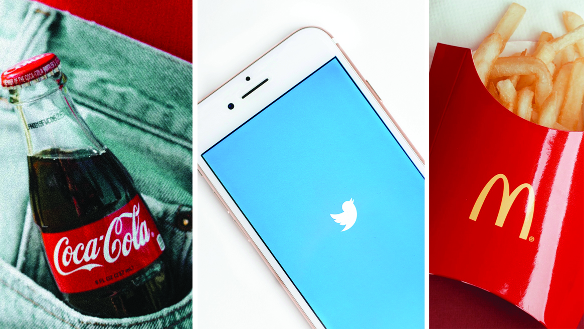
Red is associated with a variety of different connotations and is highly regarded and visibly impactful when it comes to branding. It’s known as an impulsive, lively and energetic colour with links to desire, love and passion, although on the flipside, red can be associated with aggression and danger. Brands such as Coca-Cola, Cartier and Virgin utilise the use of red in their product packaging or logos.
Seen as one of the most generally preferred colours, blue is known for its versatility, adaptable for several applications. It’s used by several tech companies and social media platforms, such as Facebook and Twitter, due to being ideal for conveying communication and reliability. Blue also expresses a calming and relaxing quality, matching its associations with the sky and the sea. Alternatively, it does have negative connotations, such as depression and sadness. Comfort, IBM and Dell are brands that utilise the colour blue in their branding.
Yellow is often associated with cheerfulness and joy, as the colour of sunshine and sunflowers. One of the most visible and noticeable colours, even from a distance, yellow is also related to energy, intelligence and clarity. UPS, McDonalds and Ferrari all implement yellow as an element of their branding and logos.
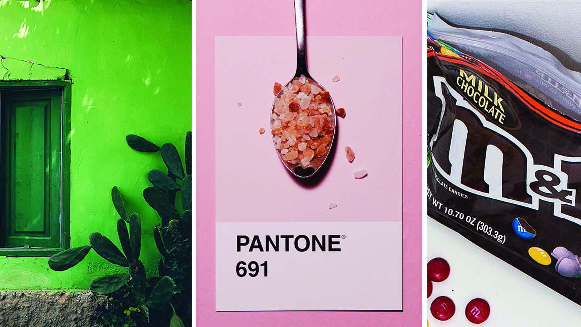
Green often symbolises sustainability, being eco-friendly, nature and the environment. When looking at packaging, green is often used to convey that the product is natural, organic, sustainable or that the packaging is environmentally friendly and recyclable. Brands that use green as part of their packaging, logos or branding are Whole Foods, Garnier and Animal Planet.
It used to be that pink was only associated with girls, and anything that heavily featuring pink was for females. However, now it seems that pink has become one of the most popular colours, with Pantone announcing that “Living Coral” was 2019’s Pantone Colour of the Year. This is shown in the fondness for ‘millennial pink’, a soft pink that is popularly used in several different industries. There are, of course, several types of pink, with pale pink often being aimed at young girls, while hot pink demonstrates more youthfulness, excitement and energy. Brands that implement the use of pink in their branding, packaging or logos are Johnson & Johnson, Benefit and Glossier.
Brown is most often used in regards to organic and natural products, from food to beauty. When looking at sustainable packaging from brands, the colour tends to be a lighter brown due to the material used, which creates a relationship between the colour brown and sustainable or recyclable packaging. Brown packaging is often simplistic, reliable and sincere. Brands that use brown logos, packaging or branding are Graze, M&M’s and Gucci.
We’d love to find out more about your product or brand and we’d be delighted to arrange a consultation to discuss your product embellishment needs – simply fill in the form and we’ll be in touch.
Alternatively, give us a call on 01733 396080


