When you think about some of the big brands like Cadbury, Coca Cola, Jack Daniels etc. often the first thing that comes to mind is the logo and therefore the colour of the packaging. If you saw a chocolate bar in purple wrapping you would automatically associate it with Cadbury wouldn’t you?
Research suggests that you only have 7 seconds to make a good first impression. That’s not a lot of time, so using subconscious indicators can help to convey a message quickly.
There is a whole psychology behind choosing colours for your brand. For example, black packaging is often used to promote a more expensive product whereas red promotes excitement and energy according to Empowered By Colour’s packaging colors guide.
Not all colours mean the same worldwide, for example in China, red symbolises good luck and prosperity but in western cultures it’s associated with passion, excitement and sometimes danger. It’s always best to consider who your audience is and make sure your packaging suits their associations with the colour – Tip, blue is considered the safest option!.
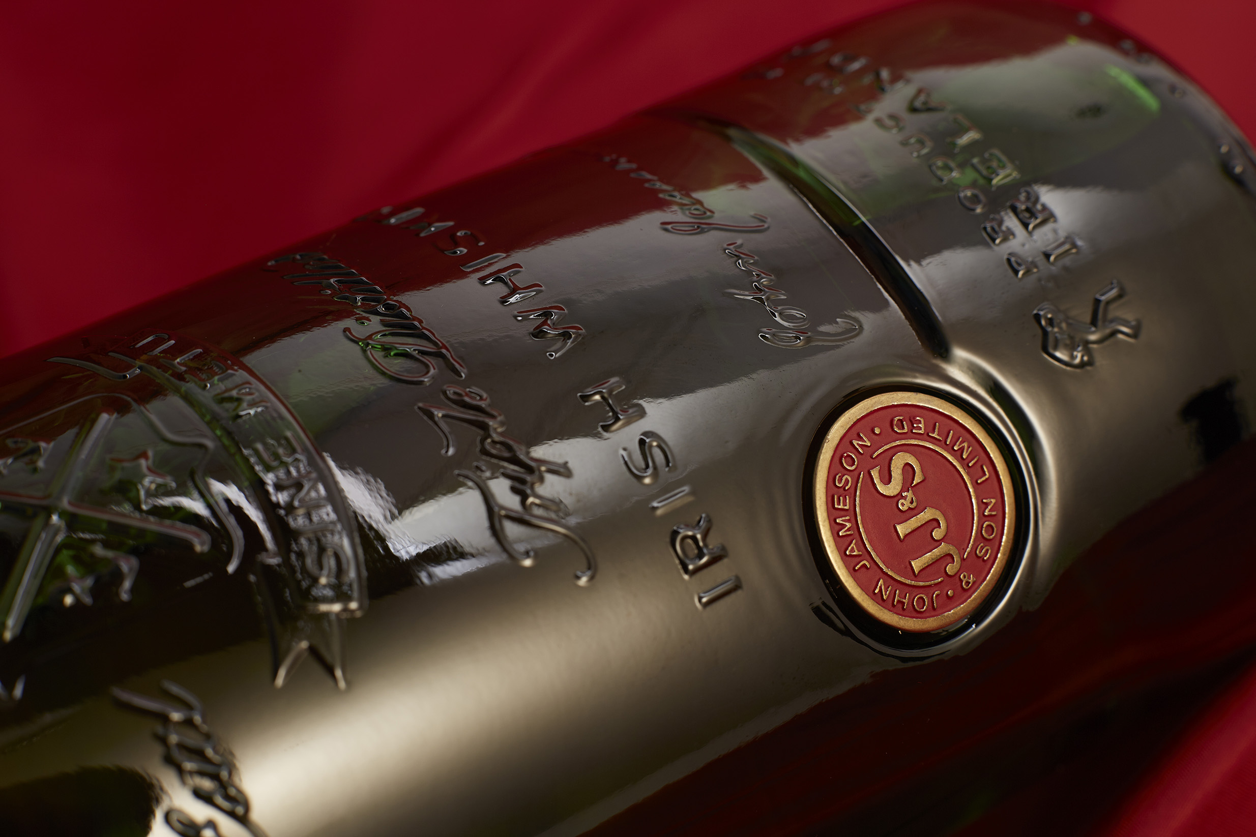
Special editions are opportunities to come up with something different; to allow your creative juices to flow, all the more, in the alcohol industry. You see this creativity in the Distiller’s Edition bottles of famous Scotch whiskeys, with their specially produced labels for one-off batches, for example. While it would be wise not to stray too far from your original branding, (keep in mind that recognisability is still among your biggest selling points), there are means to achieve that uniquely special touch.
Our resin-domed labels, for instance, are a stellar way to add design flair to your exclusive lineup. Additionally, we can develop standout insignias intended only for your occasional bottles. This is the kind of service we provide our customers and we always deliver results that reflect your brand’s principles.
Visual cues play a huge role in consumer purchasing behaviour. A study by Kissmetrics says that 85% of shoppers place colour as a primary reason for buying a product.
It’s all about creating brand awareness so that people see your packaging and associate it with who you are and the great work you do. The Kissmetrics study shows there is an 80% increase in brand awareness due to colours. If your product or brand is new to someone, the colour of the packaging can be a good indicator for them.

We’d love to find out more about your product or brand and we’d be delighted to arrange a consultation to discuss your product embellishment needs – simply fill in the form and we’ll be in touch.
Alternatively, give us a call on 01733 396080