Sometimes packaging really is black and white, but that doesn’t make it any less of a complex design. Monochrome can mean different things depending on who you ask, but as a whole, monochrome has two main definitions – black and white, or varying tones of one colour.
Despite being considered one of the easiest colour palettes to use, monochrome requires some real exploration before it can be used successfully in a design. Monochrome, while perhaps not as popular as other colour schemes when it comes to packaging, can prove to be just as impactful.
Throughout history, monochrome has been used widely in art, technology and packaging, with many artists exclusively using only a monochromatic palette. In packaging and advertising, monochrome labels were very popular as they saved money on ink, through choosing black and white instead of colour. Photographs and videos were also in black and white; part of the reason why the association with monochrome is often nostalgia.
The use of monochrome today is a far cry from the minimal, necessity packaging seen throughout history. Today, it stands out amongst the endless colour that we have surrounding us. Today monochrome colours in packaging can often symbolise sophistication or reminiscence; in fact, monochrome is in packaging in ways that we don’t always realise.
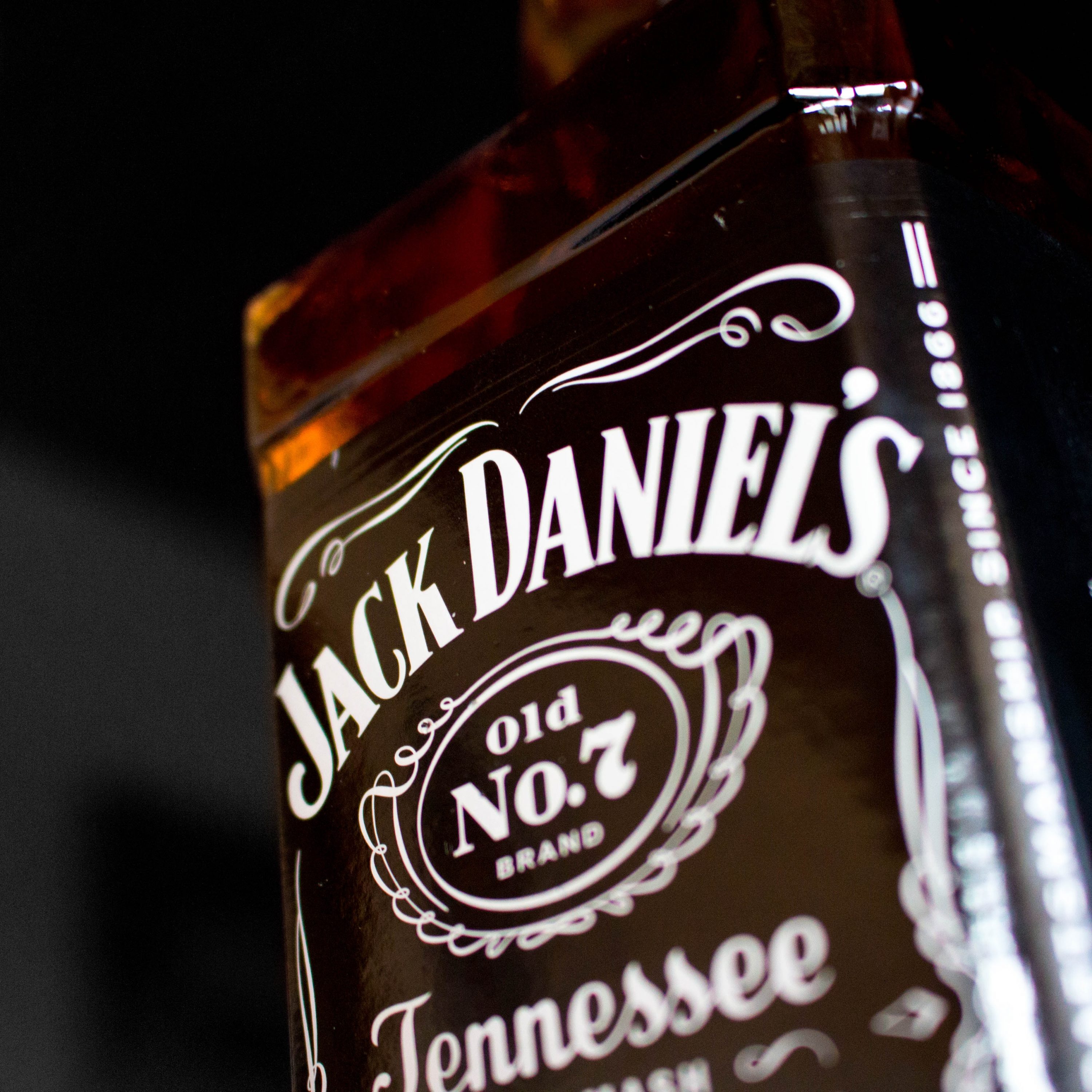
A great example of this would be Jack Daniel’s, whos monochromatic packaging is a reference back to the origins of Jack Daniel’s and their hardworking attitude. Their label reflects a lot of the original packaging design and is present in a lot of their newer products too, such as Jack Daniel’s Single Barrel. This demonstrates how monochromatic packaging can be relevant in today’s world, while still evoking the history of a brand.
A newer product that reflects the monochromatic design is Carbon Theory, a brand that creates beauty and cleansing products which feature powerful natural ingredients like charcoal and tea tree oil. Carbon Theory prides itself on keeping its products as natural as possible, avoiding any unneeded artificial ingredients. The monochromatic use in its packaging is designed to indicate the simplicity of their products, by keeping the design and colours simplistic too.

We’d love to find out more about your product or brand and we’d be delighted to arrange a consultation to discuss your product embellishment needs – simply fill in the form and we’ll be in touch.
Alternatively, give us a call on 01733 396080


