We all love the feeling of buying yourself something from a luxury brand, whether it’s alcohol, cosmetics, jewellery or clothes. As a consumer, the first thing we see when we purchase a luxury item is the appearance of the packaging.
From Apple’s sleek white iPhone box to Tiffany’s trademark blue box, we make correlations between the luxuriousness of the packaging and the high quality of the product. But in recent times we’re seeing more luxurious packaging from everyday brands.
From Pinterest to Instagram, premium design reigns supreme, whether it’s the sleek packaging boxes of affordable makeup brands, with use of statement colours or a simple but effective velvet lined fountain pen packaging. Luxury packaging designs are now becoming normalised as consumers are more aware that just because the brand is cheaper or more affordable, this doesn’t mean that it needs to lack quality in its packaging.
A great example of this is Aldi’s Christmas Pudding, which displayed luxurious looking packaging featuring design elements including an overall sleek black finish with additional red and gold detail. This packaging rivalled other brands like Marks & Spencer, or Fortnum and Mason, which traditionally targets high-end audiences.

It can feel as though your packaging may seem less eye-catching as a result of the normalisation of luxury packaging, or it’s simply missing that special something that attracts the interest of consumers. So what can you do to set your brand and its packaging apart from the crowd?
Start by taking a look at your brand’s values and mission and consider incorporating this into your packaging. For example, if one of your brand’s core values is to explore innovation while being eco-friendly, make your packaging innovative as well as recyclable and explore ways to bring something different to the table.
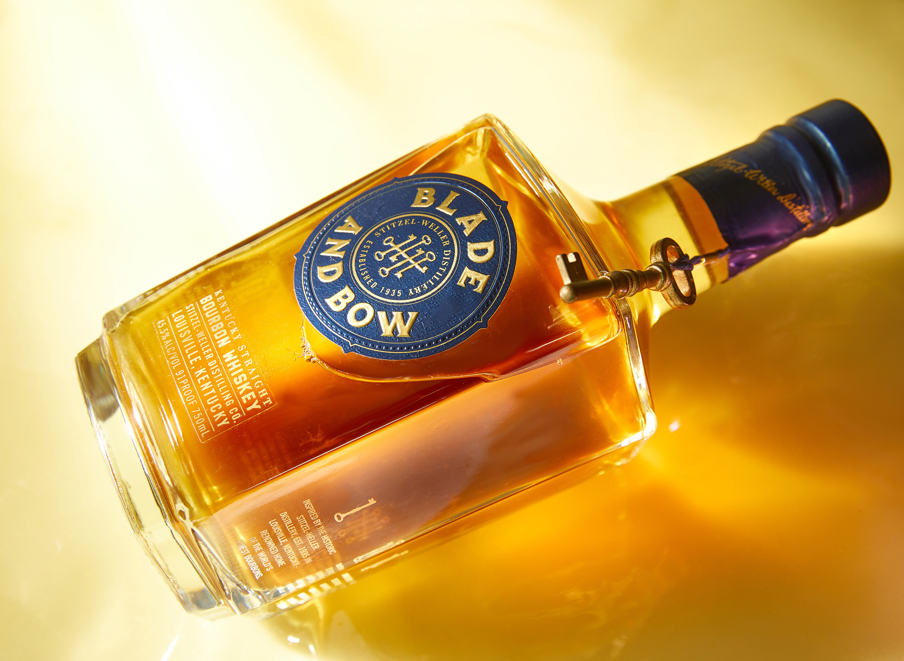
An example of this is Blade and Bow, who incorporate the five keys that once hung on the door of the Stitzel-Weller Distillery, into their brand and their packaging. The five keys represent the five stages of crafting bourbon – grains, yeast, fermentation, distillation and aging. If your brand is looking for simplistic packaging design which looks unique and chic, consider the great example that is Good Hair Day Pasta. It has a minimalistic design with an entertaining element, as the pasta in the packaging acts as the hair of the lady on the front of the packaging. As different types of pasta create different hairstyles, it’s easy to see why the packaging is eye-catching.
Ultimately, the best way to set yourself apart from so many other brands is to focus on the unique elements that your brand brings to the market and use this to develop your packaging. A great example of this is Hanger-Tea, as their product features a small paper hanger attached to each individual tea bag, their packaging resembles a wardrobe where each tea bag can hang from a clothes rail.
There are so many products in our lives every day and, as a society, we are constantly surrounded by the latest thing we must buy. This is why establishing your brand and product by marketing a lifestyle is something that customers are much more responsive too. Products that sell a lifestyle create an aspirational feeling, leading customers to think that this item will help them achieve a better quality of living, or grasp the kind of lifestyle that they’re striving for.
We’d love to find out more about your product or brand and we’d be delighted to arrange a consultation to discuss your product embellishment needs – simply fill in the form and we’ll be in touch.
Alternatively, give us a call on 01733 396080