When you think of incorporating metal features on your bottle, what is the first thing that comes to mind? A metal stopper? A recessed coin? All winning options for giving your bottle a premium feel and experience. But for these successful brands, they opted for something different. They were looking for something a little more flexible, more versatile, bolder (while still being widely recyclable) … From shape, size and colour to depth and tactility, our exclusive self-adhesive aluminium Marque™ is unparalleled. We’re glad these brand thoughts so too…
Located in New York and enthusiastic about promoting the value of selecting quality over quantity, UpEnd approached our team to collaborate on crafting a creative yet sophisticated packaging solution. Utilising premium-grade, flexible materials, our team designed and manufactured a striking Marque™ label spanning the width of the bottle. This partnership resulted in a design that not only earned recognition but also achieved a Double Gold triumph at the prestigious San Francisco World Spirits Design Competition 2020.
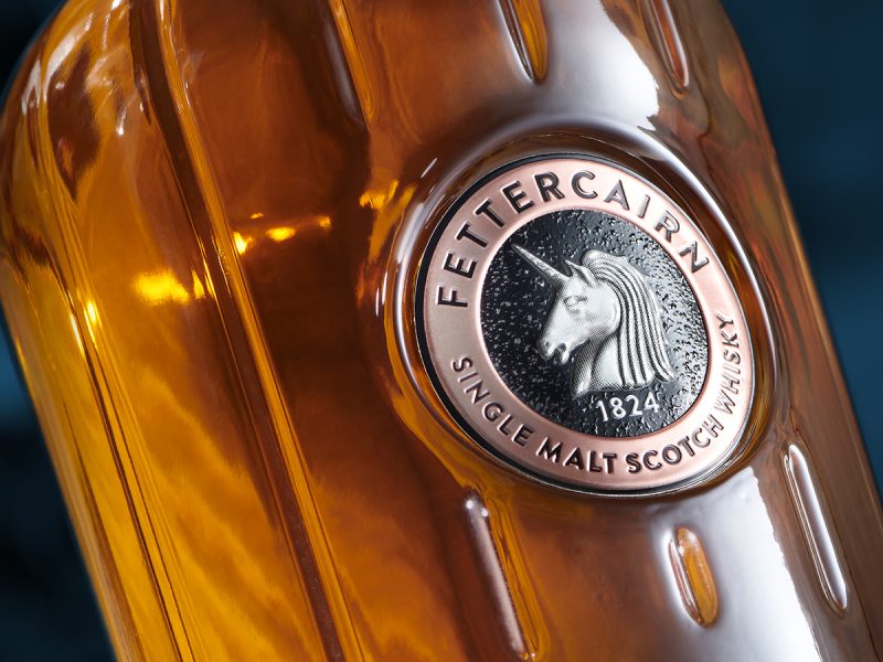
Established in 1824 and keen to preserve its brand heritage, Fettercairn Whisky used our Marque™ label to deliver a traditional, high-quality feel. With clear and precise debossed text, its clean, sharp edges provide a deep sense of quality and craftmanship. The off-white enamelled image of a unicorn contrasts against the dark textured central background, drawing the eye towards the main brand image with ease.
The challenge was to distinguish the new Silent Pool Black Juniper range as a premium gifting option while maintaining the brand’s signature visual elements. As well as various other elements, such as a die-cast stopper and a jewel-like badge, we produced a stunning Marque ™ neck wrap with high-definition metallic printing to enhance brand synergy and elevate elegance.
Source: Two Doctors/SingleDouble/Tricycle
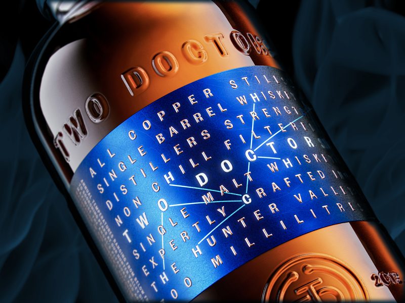
The award-winning Marque™ label truly captures Two Doctor’s sophisticated, yet modern, style. Combining contrasting print and extensive embossing techniques, the label embodies a highly versatile, textured finish the label features a variety of intricate details that spans the width of the bottle.
This prestigious project required a premium embellishment solution to heighten the elegance and rarity of each cask and barrel of this ultra-premium whisky. We designed a copper charm for the bottle and a Marque™ label for both the bottle and gift box. Each label was designed to enable personalisation, allowing Casks of Distinction to handwrite a note to every customer.
The Marque™ label’s intricate detailing and premium materials not only convey a sense of opulence but also communicate the dedication to quality. If you’re considering using Marque™ for your next product relaunch, book a meeting with one of your experts to see how we could help you or request a sample pack.
We’d love to find out more about your product or brand and we’d be delighted to arrange a consultation to discuss your product embellishment needs – simply fill in the form and we’ll be in touch.
Alternatively, give us a call on 01733 396080

