Label design and eye-catching branding is a key driver towards the performance of alcohol sales, but are you aware of the standard requirements for your label?
Understanding these necessities is not just a legal requirement, it can open a world of design opportunities for your brand, making your product the obvious choice for the consumer.
It is the right of any consumer to fully understand any product that they purchase, and public institutions are responsible for ensuring that detailed information is available. Alcohol labelling is part of a legal and comprehensive strategy to inform consumers of the relevant details related to an alcoholic beverage and educate on any potential alcohol-related health issues.
The key element of this transparency is to communicate vital information about the contents of a beverage. Nutritional information such as energy content enables a consumer to better manage their diet, while strength levels aim to ensure consumers are better aware of their alcohol consumption levels.
It is important to note that labelling requirements vary based on country of origin, so it is always best to undertake your own research.
When an alcoholic beverage exceeds 1.2% in volume, the alcoholic strength must be clearly visible to the consumer. Alcohol must be labelled correctly and accurately on all aspects of labelling, packaging, and any further presentations of the alcoholic beverage. These details are integral to the product so it is vital that they aren’t located on temporary packaging that can be thrown away.
All messaging should be straightforward and appropriate. Although alcohol is a key factor in many cultures and is largely to be enjoyed, it is commonly accepted that labelling should ensure that it doesn’t glamorise or encourage excessive consumption or inappropriate behaviour.
Details include:
Recommended serving sizes are equally necessary for health purposes, in particular, the dangers associated with alcohol consumption when pregnant. To read more about specific studies into alcohol labelling and the WHO’s discussion on options for alcohol labelling, you can access the most recent WHO discussion document HERE.
When choosing a label to promote your brand message, there are several factors to consider. Your brand name should be clearly visible and draw attention to both the product and communicate the message that you wish to convey.
There are many highly effective ways of executing this to ensure that your brand stands out amongst the crowd. Use of colour, print, high contrast and defined borders are recommended for eye-catching qualities. Pictorial symbols are also particularly efficient in highlighting alcohol-related health issues.
We’ve established the legal importance of labelling, but there can still be a unique element to your packaging that helps you convey your brand message.
Product packaging provides the first impression to the consumer, and your chosen aesthetic is the thing that can make or break a sale. The vast rise in online alcohol sales has meant that it is more important that your pack influences customers from a visual perspective. Discover more about how packaging design can help you stand out online.
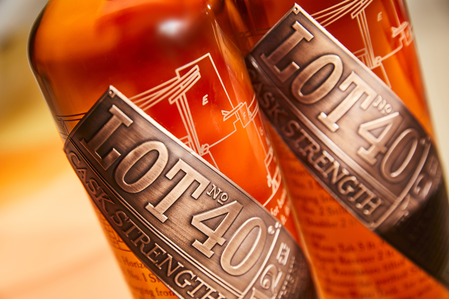
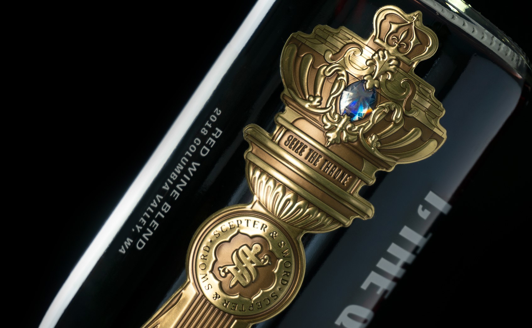
Colour choices are deeply embedded in popular products. Colour portrays an emotion and labelling should complement your product colour scheme. Take a look at our Colour Series blog for more information on the power of colour in your packaging. Metallics, as well as bright and bold colours, look dramatic and draw the eye.
You can also utilise other exciting techniques for extra impact, such as texture-laden materials. Our metal, plastic, and ribbon embellishments look striking, while our Marque flexible aluminium labels additionally create a lasting impact.
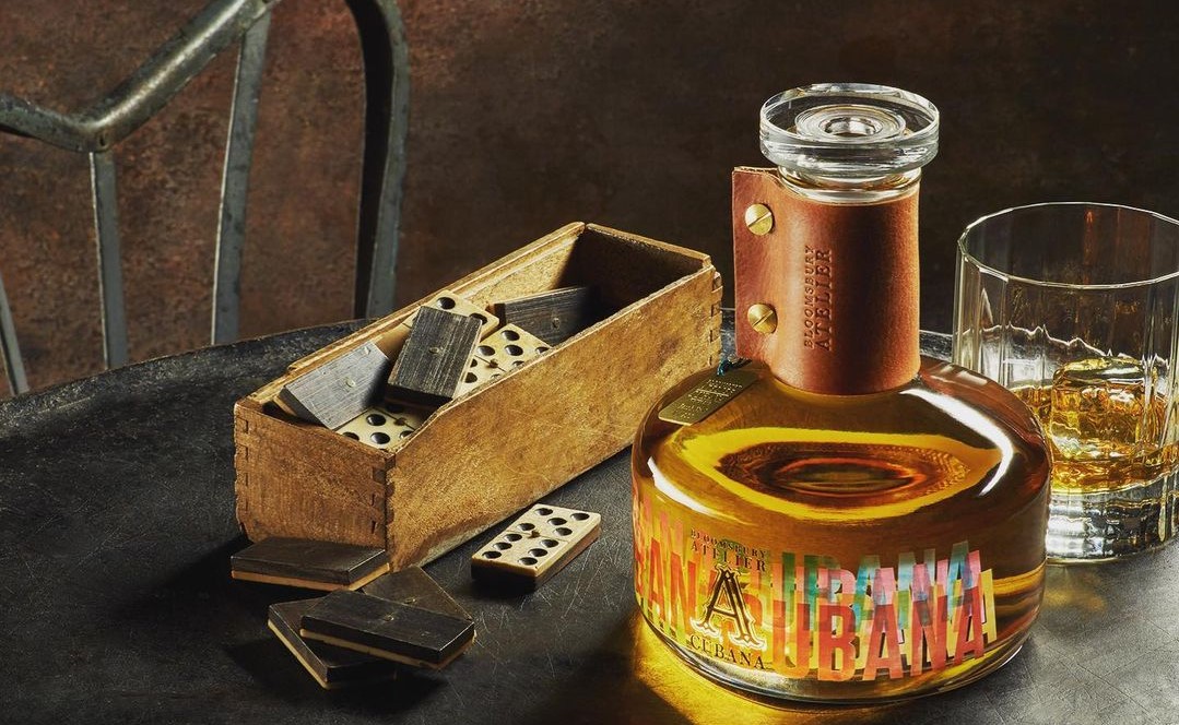
Leather and copper finishes are a great way to communicate heritage and quality, especially for brands who want to position themselves as prestigious. Our recent case study with Tyrconnell’s 16-year barrelled whisky demonstrates this perfectly. With a detailed sampling process, we were able to achieve an impeccable colour match between the label, tag, and leather cord. This attention to detail is what delivers an aura of distinction that their target consumers are looking for.
Engraving, embossing, and lamination are further processes that can create extraordinary looking labels without compromising the important detail. Read more about our range of exclusive processes HERE.
We’d love to find out more about your product or brand and we’d be delighted to arrange a consultation to discuss your product embellishment needs – simply fill in the form and we’ll be in touch.
Alternatively, give us a call on 01733 396080


